Check staffing coverage
The Coverage drawer is available only for service queue and service queue groups. It is opened and closed by clicking the arrow control below the calendar bar.
The Coverage drawer has the following views:
- Coverage: Scheduled view (default view)
- Coverage: Shrinkage view
- Coverage: Reforecast view
- Intraday: Data view
- Multiskill Coverage Map
You can use the Coverage drawer to see how WFM predicts what the service queue will do for each day and interval. It shows you if your forecast is accurate when compared to the production schedule and allows you to make post-production schedule changes.
NOTE The service level data in all coverage pages are calculated using daily totals in the Hour and Day views and weekly totals in the Week view.
Based on the metrics displayed in the Coverage drawer, you can edit the schedule to improve the overall service level goal. For example, you could reschedule an agent’s break to occur 30 minutes later to resolve a staffing issue. This schedule flexibility can make a big difference toward maintaining the daily service level goal.
NOTE If you do not see the coverage you need when editing the schedule, it might be due to the minimum scheduling duration value set for this or another service queue. Consider shortening the minimum duration or removing the minimum duration setting completely to allow for more flexibility in meeting coverage requirements.
The metrics in this drawer update automatically when you change the production schedule.
You can choose what information is displayed in a coverage chart by clicking the metrics buttons at the left of the chart on and off. You can tell if a button has been turned on if the button’s border changes from light gray to dark gray.
A pop-up appears when you click a bar in any of the coverage drawers.
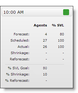
The information in the pop-up is detailed in the following table.
NOTE Interactive service queues display information in both the Agents and % SVL columns. Non-interactive service queues and any service queue groups display information only in the Agents column.
| Field | Description |
|---|---|
| Forecast | The number of agents and service level percentage forecasted for the interval. |
| Scheduled |
The number of agents and service level percentage scheduled for the interval. This number does not include inactive agents or agents who have been terminated but who are still in the schedule. NOTE If an agent is scheduled for a multiskill group, the agent contributes the service queue weight to the number of scheduled agents. For example, if the service queue has a weight of 30 percent in the multiskill group, an agent scheduled for the multiskill group contributes 0.3 scheduled agents for that service queue. |
| Actual | The actual number of agents and service level percentage for the interval. |
| Shrinkage | The number of agents after shrinkage is applied to the number of scheduled agents and the service level percentage expected for that number of agents. |
| Reforecast | The reforecasted number of agents based on the reforecasted number of contacts and reforecasted average handle time, given the desired service level goal (percent and seconds). This data is available for the current half hour and onward. |
| % SVL Goal | (Interactive service queues only) The service level percentage goal. |
| Shrinkage % | The shrinkage percentage applied to the interval. |
| % Reforecast | The reforecasted service level percentage. This data is available for the current half hour and onward. |
Coverage: Scheduled view
The Coverage: Scheduled view is the default view in the Coverage drawer. It shows how well the service queue is meeting its service level goal by comparing real-time data to the production schedule.
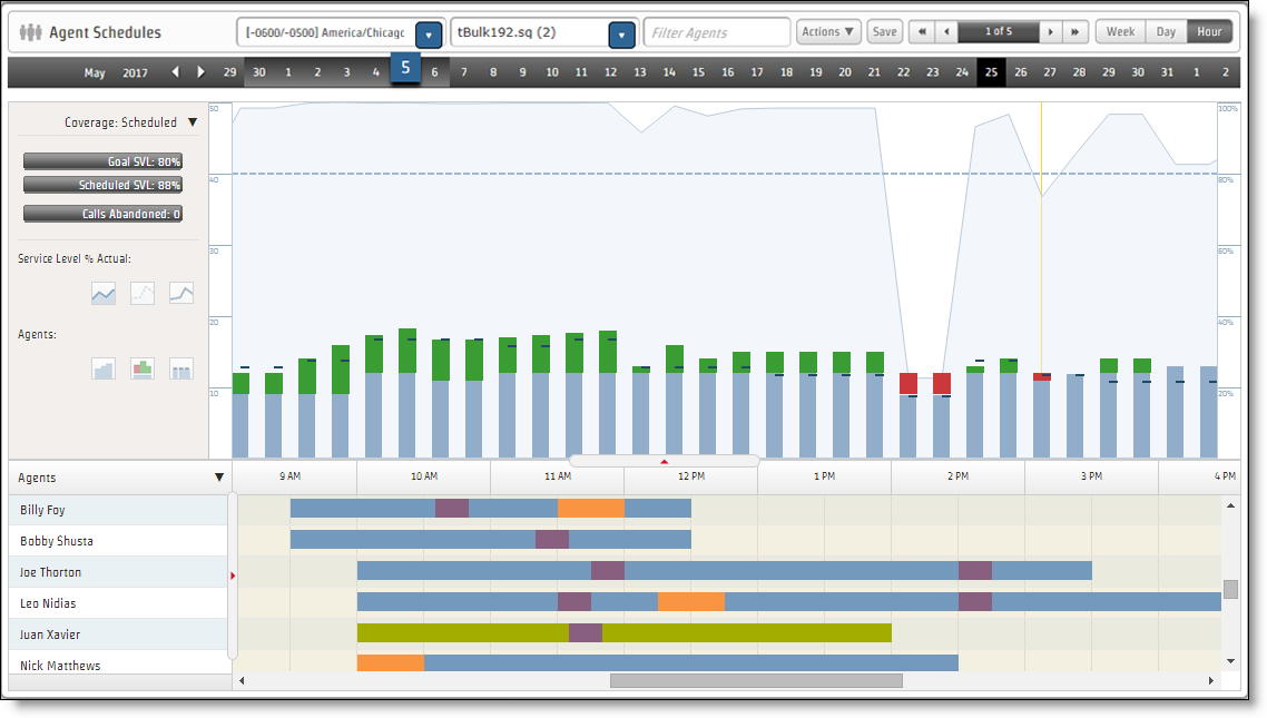
You can configure the chart to display any or all of the following metrics by clicking the appropriate metric buttons on and off:
- (Individual service queues only) Service level % scheduled
- (Individual service queues only) Service level % goal
- (Individual service queues only) Service level % actual
- Agents Scheduled
- Agents Forecast
- Agents Actual
- (Non-interactive individual service queues or service queue groups only) Maximum Contacts in Queue
The left panel also displays the following metrics for the selected time period:
- (Interactive service queues only) Goal SVL %
- (Interactive service queues only) Scheduled SVL %
- (Current and past days only for a Unified CCE ACD) Actual SVL %
- Calls Abandoned
Interpreting the chart
The Coverage: Scheduled view chart displays a stacked bar and line graph for a specific day. The bars and lines are color coded to aid interpretation. Each bar represents a 15-minute interval on the day and hour views and a 60-minute interval on the week view.
The following table describes the colors used in the stacked bar for each interval.
| Color | Agents Scheduled |
|---|---|
| Light Blue | Number of agents scheduled. |
| Dark Blue | Actual number of agents. |
| Red | Number of agents forecasted. Indicates there is a shortage of agents. |
| Green | Number of agents forecasted. Indicates there is a surplus of agents scheduled. |
To determine the least disruptive time to insert an activity, compare the Agents Scheduled to the Agents Forecast in the chart. You can use the gap to determine the number of agents who are available for the planned activity without affecting the coverage.
If there are extra agents available, you can schedule an activity without affecting the service level goal. For example, if the interval from 10:30 to 11:00 has a surplus of four agents scheduled, you can schedule a 30-minute meeting with four agents during that time.
If there are fewer agents scheduled than the forecast requires, you need to change the agents’ schedules to fulfill the schedule requirement.
The following table describes the lines used to represent the different service levels in the chart. You can compare the actual service level scores to the service level scheduled and service level goal to see what exactly is happening in the contact center. The chart shows how closely the contact center achieved its service level goal.
For non-interactive service queues, the chart displays the actual maximum contacts in queue.
NOTE The line graph representing service levels or queue metrics is available only for individual service queues, not service queue groups.
| Line | Service Level |
|---|---|
| Light blue |
(Interactive service queues) Service Level % Scheduled (Non-interactive service queues only) Maximum Contacts in Queue |
| Dashed blue | (Interactive service queues only) Service Level % Goal |
| Dark blue | (Interactive service queues only) Service Level % Actual |
Coverage: Shrinkage view
The Coverage: Shrinkage view shows the effect of shrinkage on the schedule’s ability to meet the service level. You can adjust the shrinkage percentage to see how that affects meeting the service level goal.
NOTE Shrinkage is applied only to future dates and times.
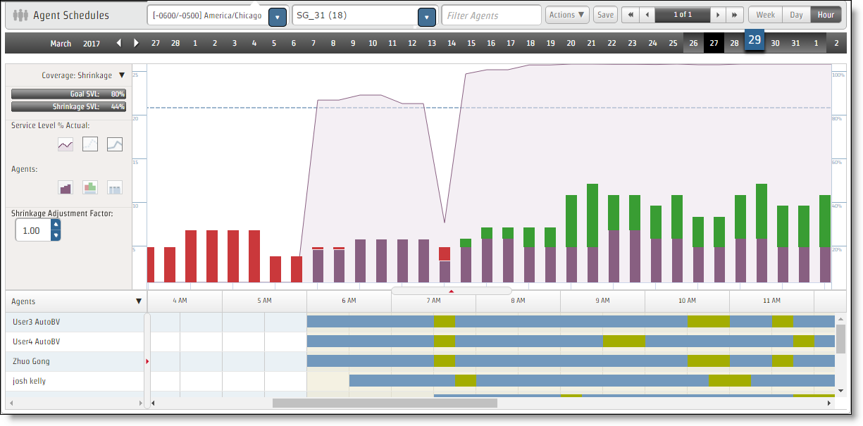
You can configure the chart to display any or all of following metrics by clicking the appropriate metric buttons on and off:
- (Interactive service queues only) Service Level % Shrinkage
- (Interactive service queues only) Service Level % Goal
- (Interactive service queues only) Service Level % Actual
- (Non-interactive service queues only) Maximum Contacts in Queue
- Agents Shrinkage
- Agents Forecast
- Agents Actual
The Shrinkage Adjustment Factor field by default is set to 1.00 (no adjustment from the default shrinkage scenario applied to the service queue). You can change the factor up or down to see how those changes impact the schedule and use that information to decide if the schedule needs to be adjusted so that the service level goal is met. For example, if you enter 2.00 as the adjustment factor, the shrinkage percentage applied to each interval doubles.
To adjust the shrinkage adjustment factor:
- In the Shrinkage Adjustment Factor field, use the up and down arrows to change the adjustment factor to a new value. Valid values range from 0.00 to 10.00.
-
Click anywhere in the chart to apply the new adjustment factor to each interval. The chart updates to reflect the new shrinkage adjustment factor.
NOTE The adjustment factor does not affect your actual forecast on the Planning page. It is only for display purposes on this page.
The Shrinkage Adjustment Factor value reverts to the default value when you refresh the window. You cannot save the revised shrinkage percentages.
Coverage: Reforecast view
The Coverage: Reforecast view shows the impact of reforecast metrics on the coverage data so that schedules can be edited based on what the reforecast metrics say might happen.
To display the Reforecast view:
- Select the current date, set the zoom level to Hour, and select an individual service queue.
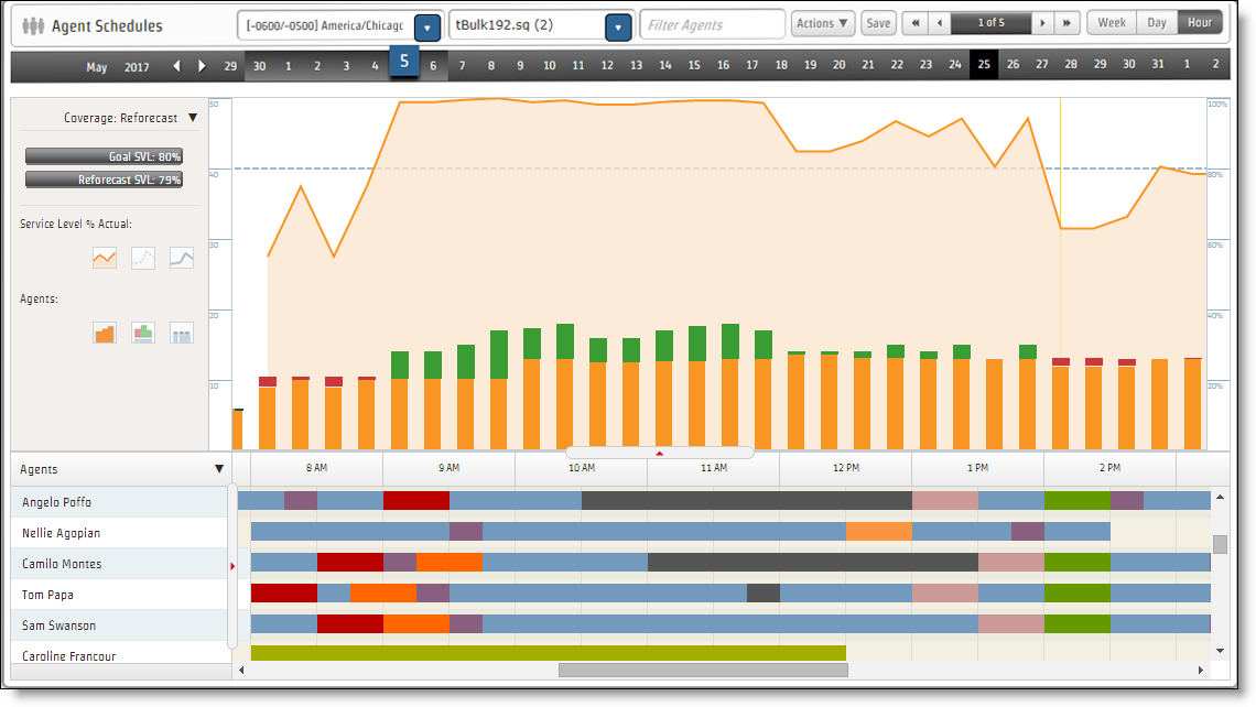
You can configure the chart to display any or all of the following metrics by clicking the appropriate metric buttons on and off:
- (Interactive service queues only) Service Level Reforecast
- (Interactive service queues only) Service Level % Goal
- (Interactive service queues only) Service Level % Actual
- (Non-interactive service queues only) Maximum Contacts in Queue
- Agents Scheduled
- Agents Reforecast
- Agents Actual
Intraday: Data view
The Intraday: Data view shows actual data compared to forecast data in chart form.
NOTE In order to display the Intraday Data view, set the zoom level to Hour, and then select an individual service queue.
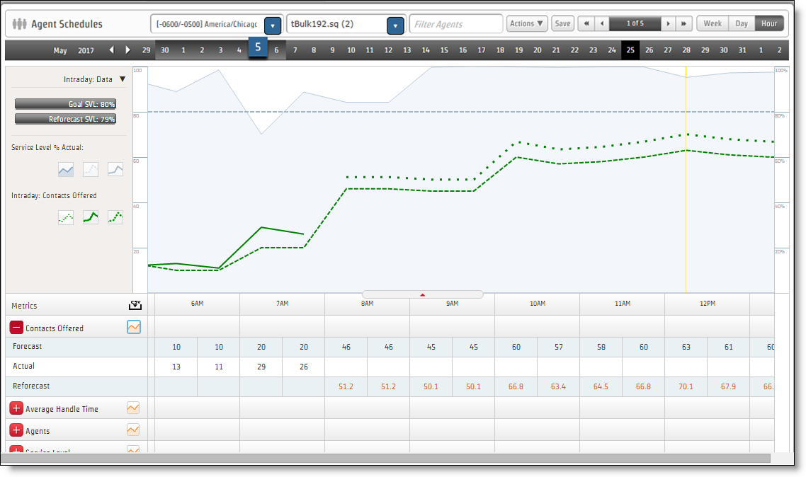
You can configure the chart to display any or all of the following metrics by clicking the appropriate metric buttons on and off:
- Service Level %—(Interactive service queues only) Scheduled, Goal, and Actual. Always available.
- Contacts Offered—Forecast, Actual, and Reforecast. Available when the Show in Graph button on the Contacts Offered drawer is clicked. If enabled on the WFM Configure system-wide WFM settings page (Enable Forecasted Contacts as Decimals), the Contacts Forecast value can have up to two decimal places, although only one is displayed.
- Average Handle Time—Forecast, Actual, and Reforecast. Available when the Show in Graph button on the Average Handle Time drawer is clicked.
- Agents—Scheduled, Forecast, Actual, and Reforecast. Available when the Show in Graph button on the Agents drawer is clicked.
- Service Level—(Interactive service queues only) Reforecast. Available when the Show in Graph button on the Service Level drawer is clicked.
- Maximum Contacts in Queue—(Non-interactice service queues only) Actual. Available when the Show in Graph button on the Maximum Contacts in Queue drawer is clicked.
The data used to create the chart is provided in tabular form in drawers at the bottom of the chart. The tabular drawers show the following metrics for 30-minute intervals:
- Contacts Offered—Forecast, Actual, and Reforecast. If enabled on the Global Settings page (Enable Forecasted Contacts as Decimals), the Contacts Forecast value can have up to two decimal places, although only one is displayed.
- Average Handle Time—Forecast, Actual, and Reforecast.
- Agents—Forecast, Scheduled, Actual, and Reforecast.
- Service Level—(Interactive service queues only) Forecast, Scheduled, Actual, and Reforecast.
- Maximum Contacts in Queue—(Non-interactive service queues only) Actual.
The tabular data can be exported in CSV format by clicking the CSV download icon to the right of the Metrics label.
Multiskill Coverage Map
The Multiskill Coverage Map view shows the staffing levels for specific service queues that are otherwise blended together in other coverage views. This option is available only when viewing schedules for a service queue group or a service queue at the Hour zoom level.
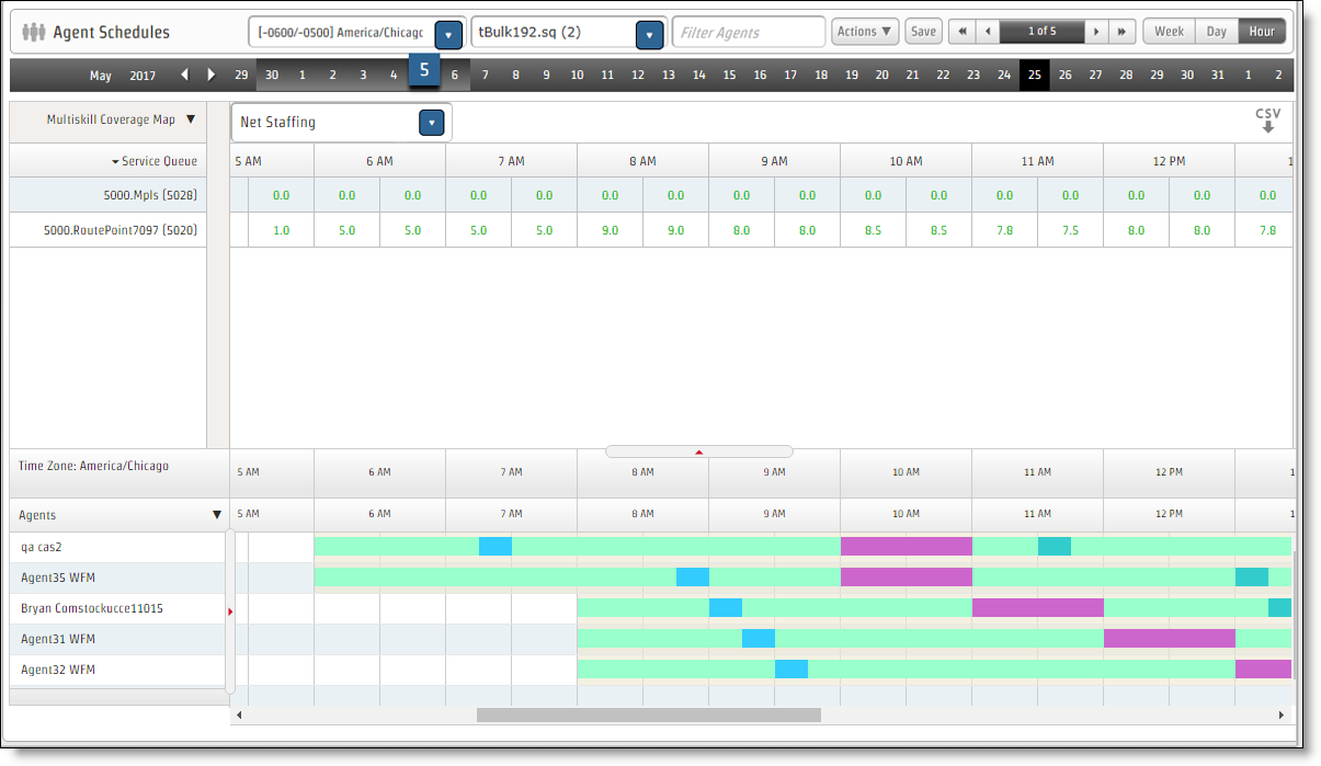
You can view the following metrics for each service queue at the 30-minute interval level:
- Agents Forecast
- Agents Scheduled
-
Net Staffing—Default view. Net staffing is a calculated as follows:
Net Staffing = Agents Scheduled – Agents Forecast
The table contains data for the set of all service queues that the visible agents can work. Only service queues with a forecast for the selected day are shown. An agent can work a service queue if they are mapped to that service queue via skill mappings or a multiskill group, or if they have a scheduled activity for the service queue during that week.
NOTE The visible agents are those who are visible to you based on your view.
The data in the table is a snapshot of the database as of the time that you selected the Multiskill Coverage Map option. Any unsaved schedule edits or changes are not reflected in this data. When you change the metric to view, the data is updated.
Click the CSV download icon to the right of the Metrics label to export the tabular data in CSV format.